#tileable background
Explore tagged Tumblr posts
Visit Tumblr Blog
Explore Tumblr blogs with no restrictions, modern design and the best experience.
Last Seen Tumblr Blogs


Fun Fact
The KCSC sent more than 20K requests to delete posts related to prostitution and porn to Tumblr from January to June 2017.
Text

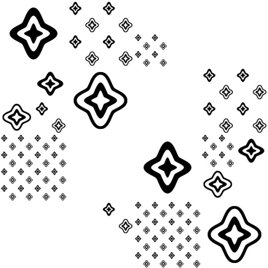
Hey everyone! Here's the aro version of the tileable star textures. The aroace ones are scheduled for tomorrow, but if you want the textures now, they're on my Ko-fi. Feel free to use on your personal website, your Tumblr CSS, or even for your artwork! And if you need to, you're allowed to edit the textures to suit your needs. The download includes up to 5x the original resolution for each texture. Download them for free here: https://ko-fi.com/s/bf3cc09fc6
#my art#digital art#pixel art#aromantic#aro#aro pride#aromantic pride#aseprite#free to use#f2u#f2u graphics#f2u with credit#tiled background#tileable background#busy#eyestrain#low contrast
21 notes
·
View notes
Text

Happy pride month! Tumblr marked my old upload of this as "mature content" (BOOO 🍅🍅🍅) so I'm reuploading this to my newly made assets blog with a proper graphic this time. Download them for free here: https://ko-fi.com/s/c558d3e704
#tiled background#tileable background#rainbow#pixel art#f2u with credit#free to use#f2u#f2u graphics#eyestrain#low contrast#busy
6 notes
·
View notes
Text
bettysgraphics_neocities_org_images_backgrounds_072.GIF
0 notes
Text
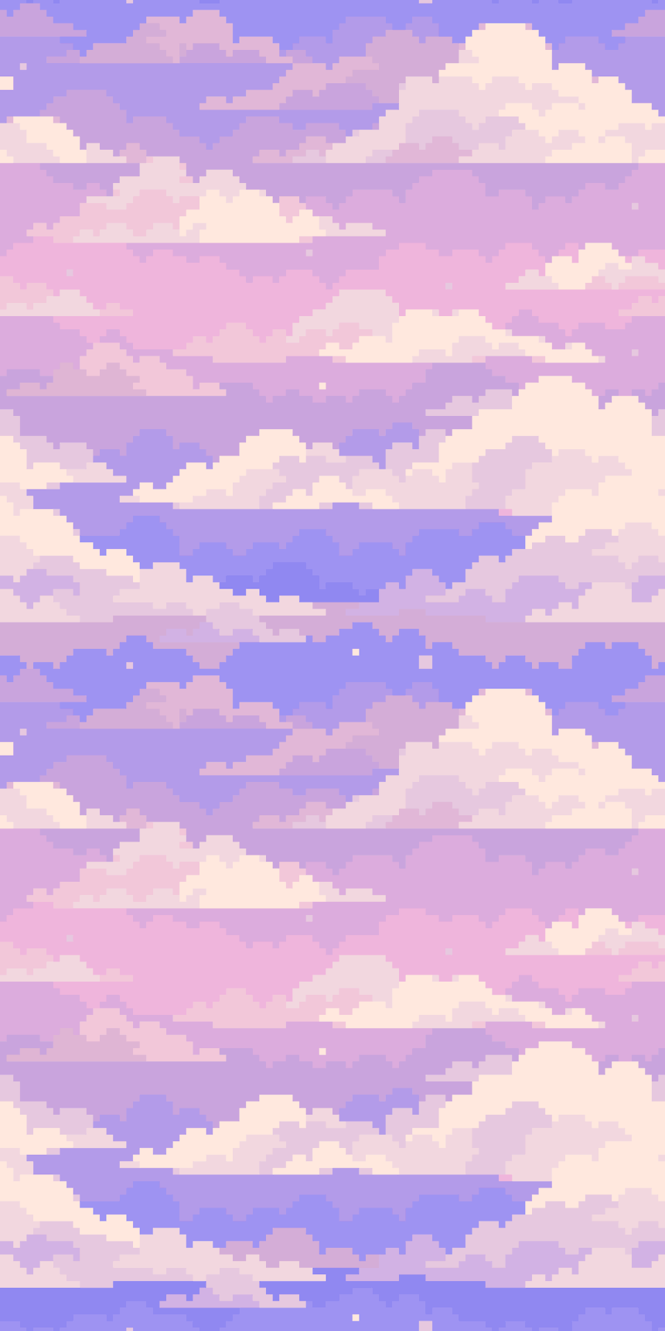
tileable clouds background i made for my gamejolt
5K notes
·
View notes
Text

The backgrounds used in the menus of Super Mario Bros. Wonder are not saved as colorful images in-game, but are recolored by the game's engine from simple black and white images at runtime. Above are two of the common backgrounds extracted from the game's files, tileable in both directions.
Main Blog | Twitter | Patreon | Small Findings | Source
370 notes
·
View notes
Text

Tileable pixel Charlie and Pim backgrounds I made for my friends; F2U
#smiling friends#smiling friends charlie#smiling friends pim#rentry graphics#carrd resources#carrd graphics#f2u#f2u graphics#neocities#mine#no credit needed
10 notes
·
View notes
Text
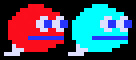
Name: Monster Rat A and Monster Rat B
Debut: Birdiy
Wow! The most abstracted rats I have ever seen in my life! No pointy snout. No whiskers. No little ears. No little handy feet. The only ratty things about them are the fact they have eyes and mouths at all, and their tails. And those things I described are the only aspects of the design!

Um. Hi, Monster Rats. Yes, I am talking about you. I would prefer if you did not stare at me like that.
Wow! They understood my request! What clever Monster Rats. So as was established, these are the red Monster Rat A, and the cyan Monster Rat B! There are only two of them, so it is easy to tell them apart. It is also easy to project character traits onto them and develop headcanons about their personalities! If you still need help telling them apart, though, think B for blue, since cyan is made from blue. Think A for red. The A stands for, "Ah! This one is red!"
You probably don't know what Birdiy is, huh? I literally just found out about it myself, and was captivated by these Monster Rats. I promise this is a real game and I did not just doodle some weird sprites to prank you! Look at this:
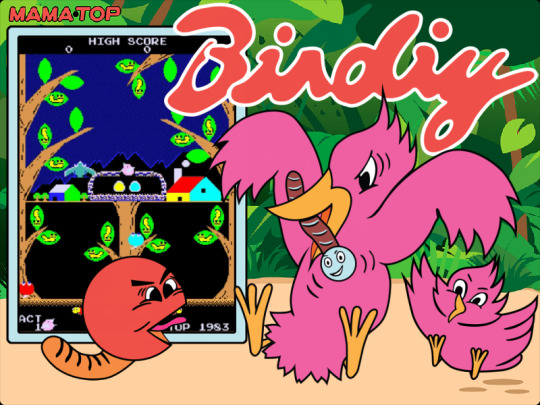
See! Birdiy! An arcade game about a mama bird collecting larvae to feed her babies! And look, there's our friend Monster Rat A! Hi! I guess the lines on its tail are to make it look like a wormy rat tail, but the shape is not helping anything. It looks like a waxed cheese wheel with a floppy baguette sticking out of it. I'm glad it does! This image reassures us that it is, indeed, supposed to look so baffling.

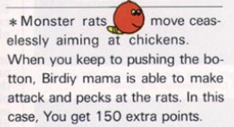
The goal of both Monster Rats is to eat the little baby bird whole. Yes, they are enemies, no, they are not Bad Guys! These are just some creatures! Despite what the media may suggest, being a baby bird does not make a creature morally superior. Sometimes a baby bird is simply eaten, by a Monster Rat. It's fine. It's good!
Look at this little drawing of Monster Rat A from the flyer, which also calls them CLEVER monster rats in another section! So silly and cute. They call the chicks "chickens" here. This game did not sell well at all. But you can bet I'm pointing to Monster Rat if anyone ever asks me to give an example of #retro 1983 nostalgia! It's a little sad Monster Rat A gets all the drawn art. All both of it. Thank goodness for hue shifting!

There you go, Monster Rat B. Now there are as many images of you in the world as there are of your crony!

Oh yeah! There is a skunk in this game, too. Just in case you were thinking they just couldn't draw quadruped mammals, and went with lumps instead. They can indeed draw quadruped mammals! They could have drawn actual rats! And I love actual rats, but thank goodness they didn't! I love everything about Monster Rats, little as there may be to work with!
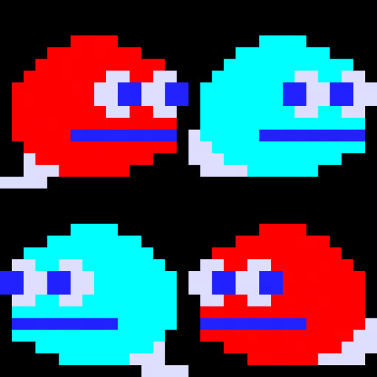
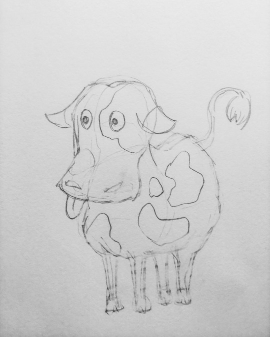
Here is a tileable image of our friends the Monster Rats. I made it my background, then changed it back because it did not look very good at all. This is my gift to you.
160 notes
·
View notes
Note
hiii your f/o shrines (and website in general) are SOOOO cool its inspired me to make my own :3 where do you find all your blinkies gifs stamps and buttons?? :D
Hiiiii I can send you the template if you want!! It’s p bare bones but it’s cute imo
Okay so
Sites
^ a branch of the internet archive dedicated to geocities graphics!! This is where I got the bg + most of the dividers, almost my entire gif collection comes from here. Hotlinkable
^ this is what I used to generate my text graphics! You can’t hotlink to it so make sure to save each word and then host them on neocities directly
^ where I got most of the small graphics in the shrines! + some of the BGs it also has a text generator but I didn’t like it, hotlinkable
^ I got a handful of the bgs from here but I don’t super love most of them, not hotlinkable
Buttons + blinkers:
39 notes
·
View notes
Text
Visual Fixes and Overhauls
‿︵‿︵‿୨ ୧‿︵‿︵‿‿︵‿︵‿୨ ୧‿︵‿︵‿‿︵‿︵‿୨ ୧‿︵‿︵‿
← Back to list of resources
‿︵‿︵‿୨ ୧‿︵‿︵‿‿︵‿︵‿୨ ୧‿︵‿︵‿‿︵‿︵‿୨ ୧‿︵‿︵‿
Fixes
simsi45 Tileable Items Shader FIX
Lighting
BoringBones Ethereal Glow
simbouquet CAS Lighting Edit
simsi45 Reworked & Improved EA Lights
simsi45 Improved Environmental Shadows
Texture Replacers
BoringBones Project Eden - Replacement for Street and Terrain Retextures
BoringBones Botanika - Plant and Flora Replacement
BoringBones Metropolis Reborn - Architecture Enhancement Pack
BoringBones Retextured Lighthouse - Supreme Definition
BoringBones Delicious Renewal - Replacement for Dishes
BoringBones Roof Set
BoringBones Snow Replacement for The Sims 3
User Experience
Knight Annoyances Disabler
User Interface
Arro No ''Mod Scripts Found''
AyaJulia Longer Interaction Queue
BoringBones Load Screen Replacement
BoringBones Background Replacement for Create a Sim
DB5 Hidden Item Unhidden
Ellacharmed No Intro with Maxis Logo
Fanaskher More Beauty Marks, Freckles, & Wrinkles Slots
MenaceMan44 Equestrian Centre Map Tag Replacement
21 notes
·
View notes
Text


a seamless/tileable background i drew based on early 2000s emo art! completely free to use (credit isn't required but appreciated!)
full-size wallpapers under cut


17 notes
·
View notes
Text

Last texture! The aroace one. I think this will be the last one I do of these star textures so I'll be moving on to something else. Feel free to use on your personal website, your Tumblr CSS, or even for your artwork! You're free to edit them to suit your needs as well. The download includes up to 5x the original resolution for each texture. Download them for free here: https://ko-fi.com/s/404cc17025
#my art#digital art#pixel art#aseprite#aroace#aroace pride#aromantic asexual#free to use#f2u#f2u graphics#f2u with credit#tiled background#tileable background#busy#eyestrain#low contrast
8 notes
·
View notes
Text

chapaa chapaa chapaa chapaa ch-
Got in the mood to make some tileable chapaa patterns for my new PC and thought it'd be fun to share em with the community too!
Feel free to use them for your Palia related needs; blog headers, backgrounds, pagedolls, avatars, decor in general, have fun! Credit is appreciated but not necessary.
{{ Individual files can be grabbed in my sta.sh over here }}
11 notes
·
View notes
Text
Animation Brief 01 - Week 2 - Parallax Background
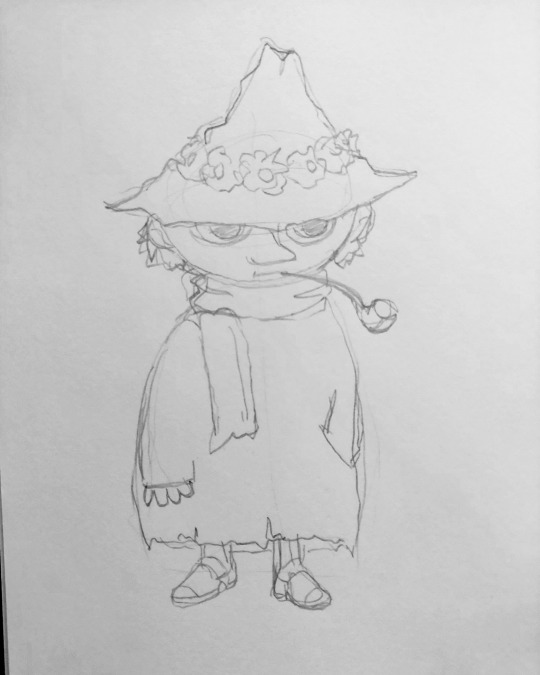
Above: Snufkin just chillin
Putting together a full parallaxed background was the biggest individual step in our "World Building" brief, which is why I kept putting it off. I was told by Yvonne that the work had to be produced physically before being digitally composited, for someone who hates painting this was bad news.
I guess like always, the first step was research and gathering reference. I chose Tove Jansson as my artist-to-emulate which proved a bit of a headache in itself. Jansson was prolific and diverse, working with different styles in different mediums regularly in her seven decades long career. A lot of my favourite works of hers are simple black ink on white paper illustrations. But mimicking that style would've gone against the spirit of the project.
I decided to buy a beginners set of gouache paint for a tenner and try to emulate her painted work, the likes of which can be seen on the covers for her children's books. I'd never used gouache before so I don't really know what I was thinking, other than that I knew I was sick of acrylic. Anyway, the first step was a sketch.


Above: Yeah not much going on...
Honestly looking back on this I probably should have spent more time drafting a good composition and actually thinking through the shot I was intending to make. It's not that I didn't give it any thought, just that when you're on a tight schedule and commit to an idea, you're stuck with it. The longer I worked on this project the less I liked it, a bit more foresight at the beginning could've helped prevent that. Ah well.
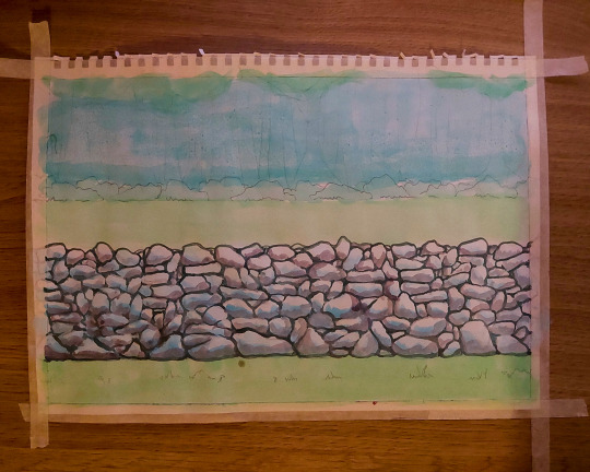
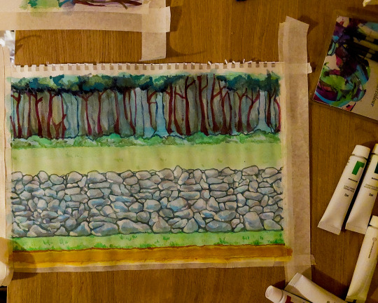
The composition I went with was a combination of a couple of my landscape sketches. I decided with my "mini-me" limited to being shot from the shoulder up, a horizontal parallax would work best. Basically a simple side-scrolling shot, like holding a camera out a car window. I took the forest backdrop from Cratloe Woods, the classic Irish dry-stone wall from the farm, and I threw in some road signs (and Snufkin) for a bit of fun. The only problem was now I had to paint it...


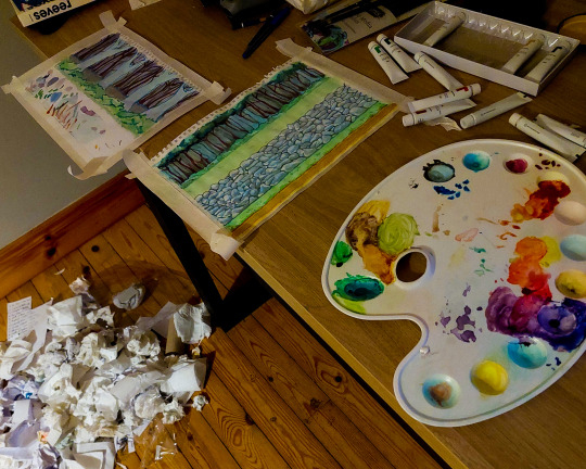
Above: A real Artíst's palette...
I had no idea how to use gouache. I even used the regular ass paper from my sketchook which was probably a mistake considering the number the water did on it. I started out dampening the paper a bit before going over the major areas with a wash of an approximate colour. You can really tell I worked left to right on the wall because it gets slightly less shitting as your eyes pan across it. The wall was great fun in general, basically just laying down shadows, darkening the crevices and building up the tone. I think I overworked it looking back, although that's true for the painting in general.

Above: Cameos
Don't have much to say about these sketches, I was working fast and trying to have fun with them while keeping in Jansson's style. Also if it's not obvious I take all these photos at night when there's no natural light cause I'm stupid...

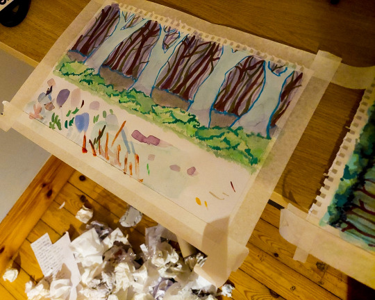


Above: Ignore the giant pile of rubbish, I cleaned it up after I promise
At first I really wasn't happy with the treeline in my first painting so I tested out some ideas on another sheet. I liked how it turned out, and I was thinking of incorporating it into the animation, but as the trees are the furthest element in the composition, they will move the least in the parallax shot, making it a bit infeasible. I did reuse the bushes as a foreground element though.
The next step was a tedious one, scan the water-warped paintings on my shitty scanner, disassemble them in Photoshop and stitch the edges as to make them tileable. Honestly I actually enjoy this kind of tedious Photoshop work, I just hated my painting and the shot in general so having to look at them over and over wasn't exactly fun.
Anyway, having made liberal use of the offset filter in Photoshop I had all the layers cut and tileable and ready to import into After Effects. I kind of suck at After Effects so this took longer than it should have. I tried to create the parallax effect in an old school manner by parenting all the layers together and setting a keyframe on their position, and adjusting their start position individually to control the speed at which each layer scrolled. Sounds easy.
I wasn't. Apparently I can't parent properly cause it was anarchy trying to control the speed of the individual layers. Eventually I just watched a Youtube tutorial and used that guy's method, creating a new camera and parenting everything to a null object, then moving the individual layers back in z-space to create the parallax effect as the camera pans.
I'm tired as I write this and I'm unsure how intelligible it is. Here's the horses mouth explaining things if you want to watch for yourselves:
youtube
The worst part is after all that it's still just a rough composite. Even beyond the obvious absence of my mini-me, there's a lot of problems in regards to the speed of the individual layers, the foreground elements look more like they're moving on a treadmill than receding in space. A particular cardinal sin I committed was not matching the speed of the grounded elements to the ground on which they're well, grounded.
Anyway I can fix all that later, I'm just sick of looking at it for now.
7 notes
·
View notes
Note
Hi! Great fan of your work
I am a small pixel artist and developer, though not very active in neither of them
Without many rodeo, my ask is: how would you go about adding depth to a side view projection?
I find side views charming for characters, and having an eye line/horizon line around the hip or chest of the characters is a perspective I find very interesting in traditional art and for 3D games, but I have no clue how would be a nice way to go about it on tile-able pixel art
I know isometric is very nice for giving depth, but it also tends to emphasize the environment way more than the characters
Thanks
it works better with outside stuff, but basically you would have 1 layer of main tileset that the player walks on (playfield) and some other bits and pieces on the wall
1 layer of background tileset (say they go into a cave interior, it would be back cave wall patterned or something) which has no collision
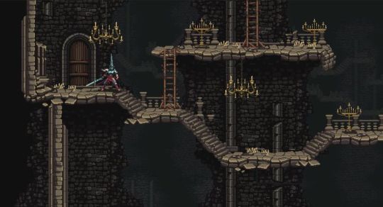
example of wall tileset that breaks away to reveal more tileset behind (blasphemous)
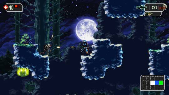
and an exterior example (the mummy demastered)
then you could have a few + layers of parallax outside

owlboy (above) is actually done in "chunks" not tiles, which is more work, but has a more natural and open feel

this was made for an illustration so it's not tiled at all, but there's no reason it couldn't be. both the foreground, playfield and midground laters could all be tileable. you could even have more moving parallax layers behind
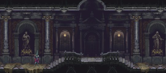
parallax layers can be done well inside too, by making more interesting architecture than just a box room
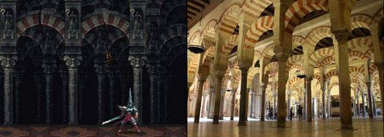
inside it's a bit more tricky, some games tend to do a forced perspective look, where it's from almost a straight-on angle, but just tilted a bit to show some of the side. it's not correct but it looks better than just straight-on, a bit more interesting
(blasphemous 2) these envivonments are really stunning. and yes you need a lot of tiles for something like this, but if that's what you're going for it's the only way
these games are gorgeous you should get them just to look at them
owlboy blasphemous blasphemous 2 the mummy demastered
123 notes
·
View notes
Text

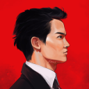
Tileable red background featuring an extremely large amount of Mario character artwork overlapping itself, used starting in 2017 on Nintendo's official site for the Nintendo New York store.
Main Blog | Patreon | Twitter | Bluesky | Small Findings | Source
134 notes
·
View notes
Text

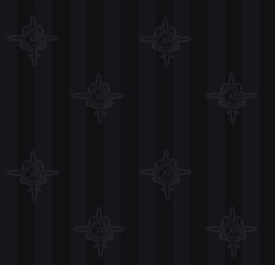

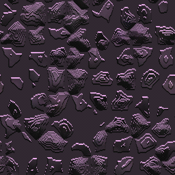
Some tileable grucifix backgrounds I made, feel free to use with credit! You can change the scale of the tiles to adjust the pattern size as well
8 notes
·
View notes